
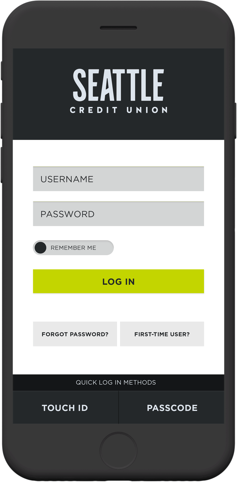
The mobile app features several login methods. Standard username and password fields are the most popular and therefore the prominent fields featured on the login screen. Users can also choose to enable Touch ID if they’d like to login using their fingerprint, or they can use a passcode if they’d like to set up and use a unique string of numbers. Both of these methods improve the security of the login process. The login screen allows users who want to bypass this step in the future to be “remembered” by the app through a toggle control. The login screen also accommodates users who have forgotten their password or are first-time users.
Seattle Credit Union
Tools
- Adobe XD
- Figma
- Xcode
- OptimalSort
My role
- Lead UX/UI Designer
- Product Manager
Deliverables
- App architecture
- User research
- Personas
- User flows
- Wireframes
- Mock-ups
- Prototypes
- Placement on iOS and Android app stores
An app to make everyday banking easier
Over the years working for Seattle Credit Union, I led three app designs. Each iteration aimed at improving usability, accessibility, and overall user experience. As the lead UX designer, it was my job to interview, analyze, and understand the needs of our mobile app users; work with our Operations and IT teams to build scaleable functionality; interface directly with the engineering teams to communicate the product vision; and finally to design solutions that made banking with Seattle Credit Union easier than before.
From interviewing users, reviewing app feedback submitted through our UX support channels, and reviewing the analytics we identified a few central themes for what needed to be improved.
- Improve the security of the login process by making the secure login features like Touch ID and Passcode more accessible.
- Make checking account balances easy to do from the home screen.
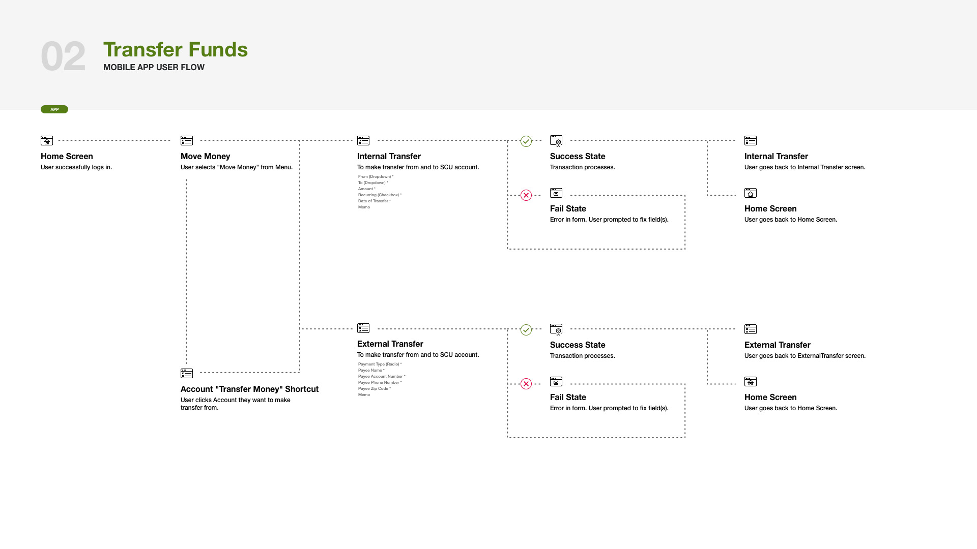
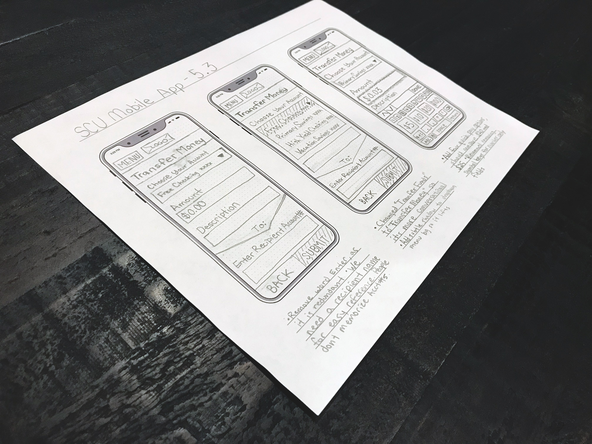
- Reduce extra steps from the transfer money flow.
- Make the chat tool a viable alternative to calling our contact center and eliminate the need for email and calls, which are less secure and take longer for the users.
- Incorporate the payment tool directly into the mobile app, and give users better context into when their credit card payments will be due.
- Make digital payments easier through the app by introducing copy/paste functionality of user’s card information.
- Give users intelligent insights into how they are spending and saving to promote good personal finance habits and empower our users to successfully manage their money.
- With the increased interest in digital wallets and automatic recurring payments, improve the accessibility and management functions of these features.
- Improve the rate of successfully deposited checks through the app. (Our goal was to get the success rate up to 99%, up from 92%, with most issues stemming from improperly endorsed checks.)
Working on the app redesign, I was also able to improve the visual design used throughout the UI to enhance the hierarchy of each area making it easier to understand the relationship of each section, improve the discoverability of UI controls, improve the accessibility of our mobile app, all while building in moments of surprise and delight like the “success” screens for accomplished actions.
1
Login Quickly & Securely
2
Easily Manage Your Accounts
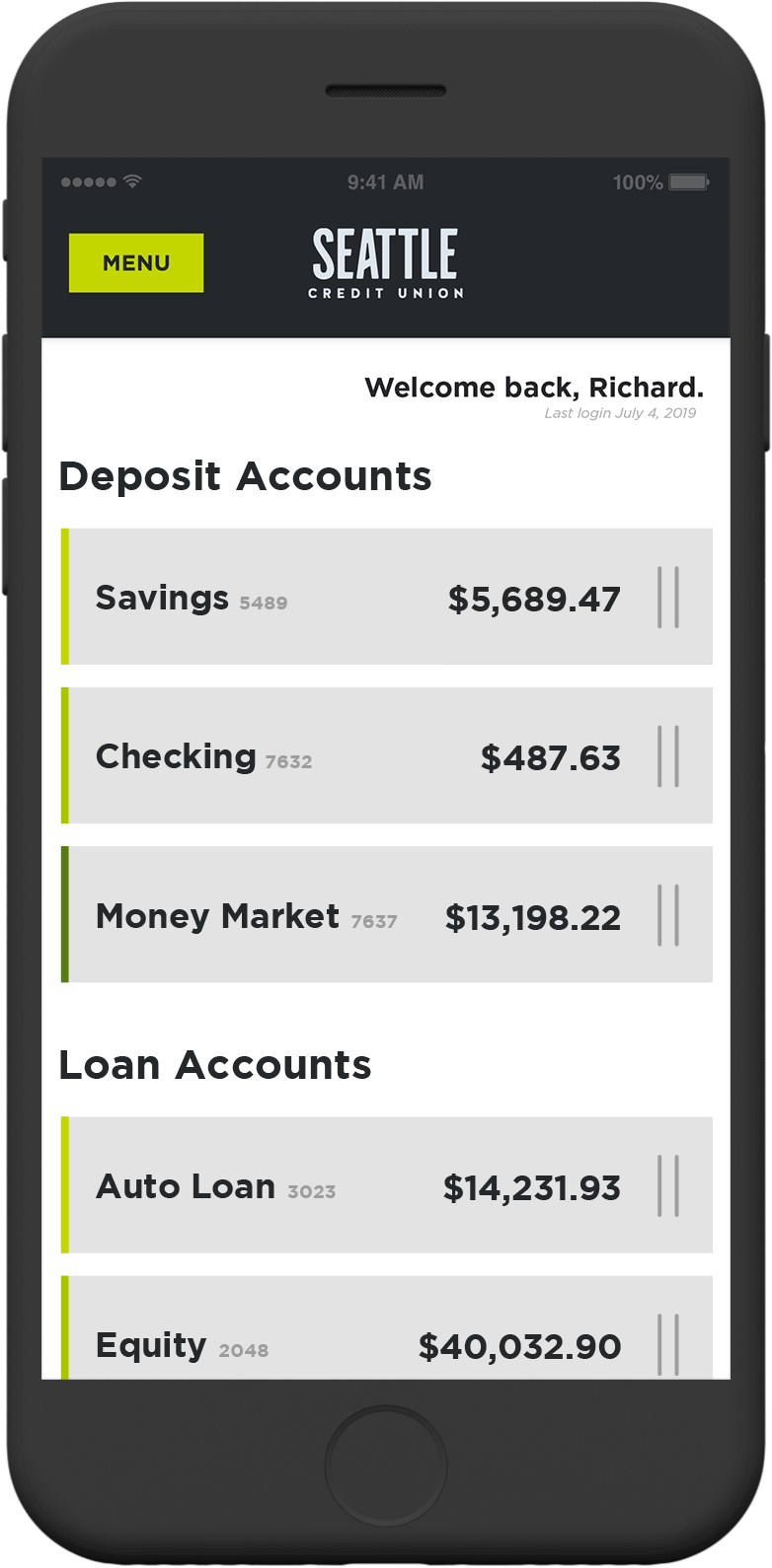
After studying popular user-flows of the earlier versions of the app, I discovered the two most common use-cases for our deposit accounts, were users trying to make a “quick transfer” or to “view activity” on their account. For loan accounts, users wanted to either “make a payment” or to “view payments” to ensure their loans were up to date. In both cases, we added a slidable card for every account that revealed these two options from the main Account Overview page. In the first quarter of the app update, we noticed issues submitted to our support line reduced by over 10% for these four common tasks, likely due to the improved visibility.
3
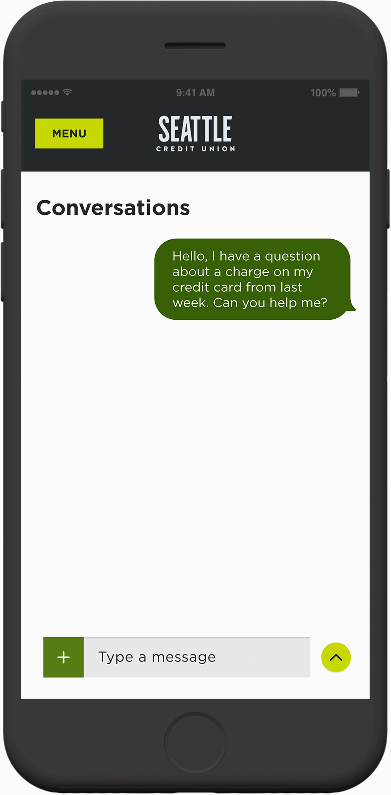
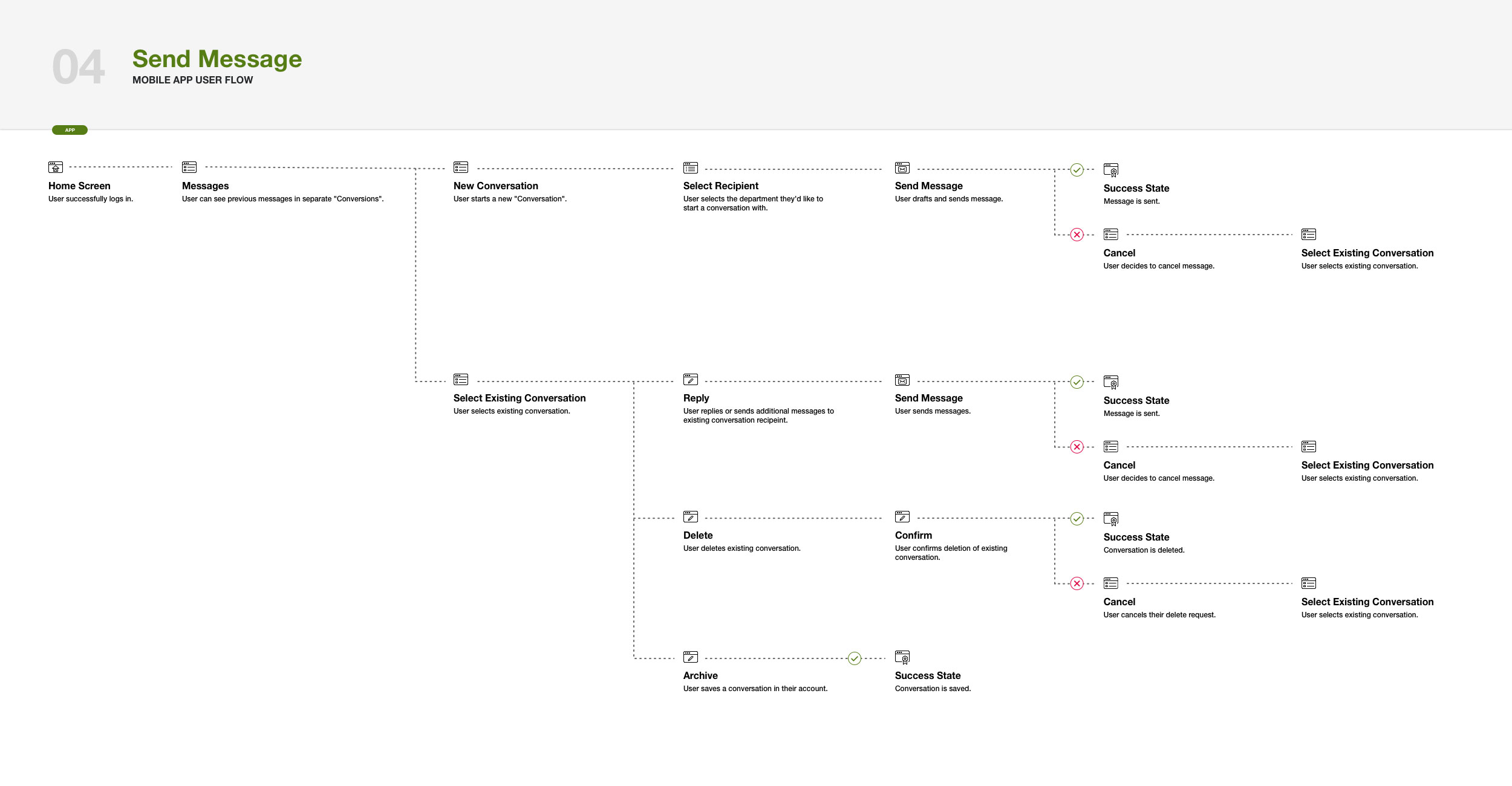
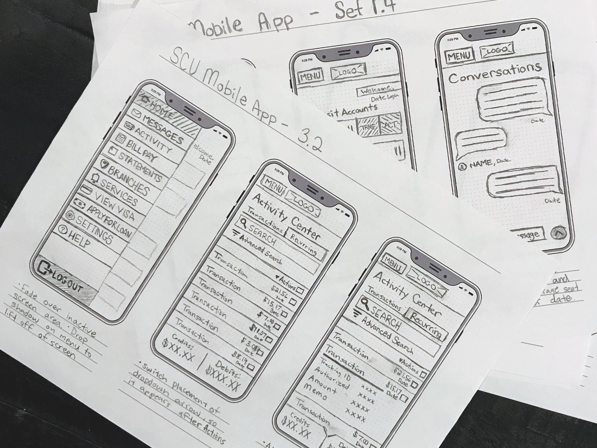
Securely chat and Get Questions Answered Fast
The old messaging system directed people to forms that were emailed, making it difficult to add information or context to an existing query. We redesigned the chat functionality to feel familiar, like the texting and messaging apps our users were already familiar with. We also wanted to integrate photos and names of the Seattle Credit Union member service representatives to add a human element to the product. This also aids when members have follow-up questions and want to know who helped them with their request the last time.
A picture is worth a thousand words. That’s especially true for screenshots when trying to explain a sometimes complicated error or inquiry. The message field also gives users the ability to upload screenshots which greatly reduced the time it takes member representatives to properly assess the user’s issue and offer a resolution.
4
Intuitive navigation
From the user interviews, we conducted and the user flows we could see from our analytics, it was clear that we had some information architecture issues, mostly stemming from the fact that new products and features were added to legacy app navigation that didn’t really align. We took all of the different pages of the app and grouped them as different tasks a user would want to perform. We then sent out links to our test group of users and asked them to sort these into appropriate categories using OptimalSort, a web-based card sorting tool. We started with an open card sort, allowing the user to submit their own ideas for categories. After we had over 30 responses, we then reconfigured the card sort to utilize the most common categories from the submissions and ran a new closed card sort on a separate group of test users. Ultimately, we were able to identify patterns in the way users sorted the content and redesigned the navigation to match this language. We also added icons next to each item to make it easier to skim and remember.
5
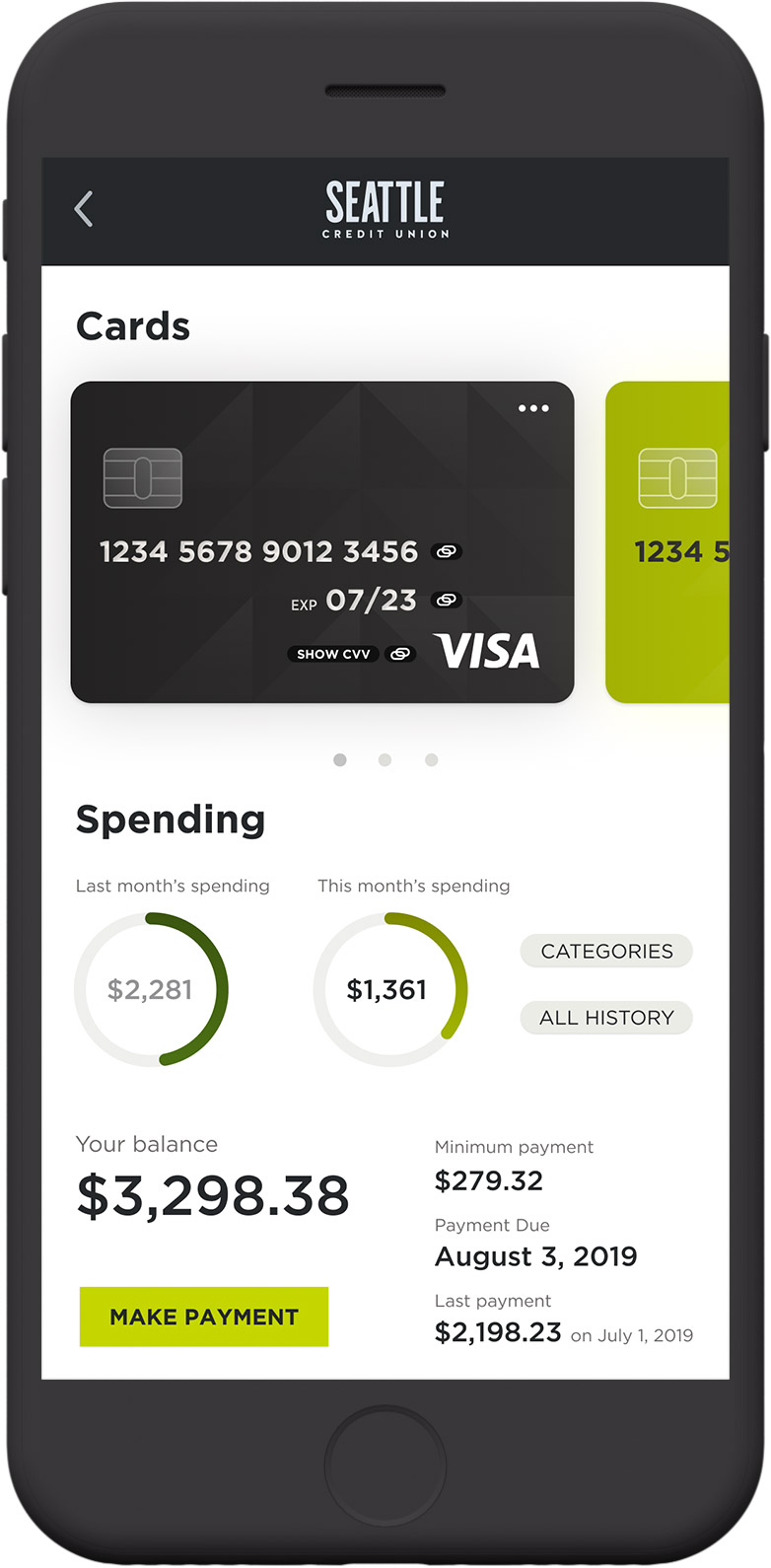
Easily manage cards
Seattle Credit Union offers a suite of different payment card products. The way these were managed within the app, left a lot of users confused though, as all of these functions linked off to a separate site. In the redesign, we aimed to consolidate this functionality into the main app, while also giving the users controls to do their most common tasks like finding their card information, finding payment status, making payments, copying their card information for easier web-based shopping, and also gave access to lock a card or request a replacement card all through the same screen.
6
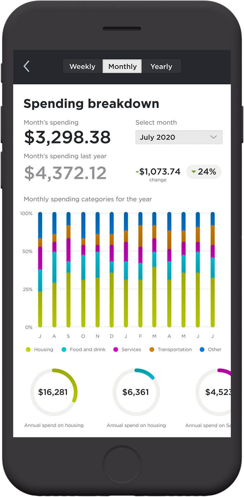
Track spending and get smart budgeting help
In an effort to carry out the mission of the credit union of empowering members to achieve financial prosperity, I designed a series of KPI visualizations to inform the user about their spending and promote good personal finance habits. The personal finance manager gives the user the ability to break out their spending to weekly, monthly, or yearly levels of scope, and assess the categories in which they’re spending. In user feedback, most users said they used tools like Mint or even personal spreadsheets to manage this if this did it at all. Our goal was to give our product even more value, by putting these finance tool right where they already are.
7
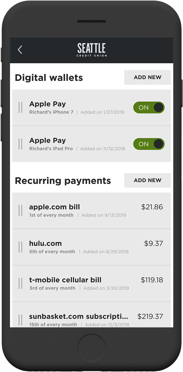
Control your digital wallet and recurring payments
Based on our product data, when “digital wallets” first rolled out it was a very low-demand feature from our users. However, with the increased promotion by companies like Apple, Android, and Samsung, we started seeing matching demand for requests to support their various payment systems. In the design, we aimed to give users the ability to see at a glance which Digital Wallets were associated with their accounts, the devices that were authorized to spend from their account, when the connection was established, and of course turn that connection on or off. Similarly, we wanted to give users a similar set of information and control for their recurring payments associated with each account. I designed these controls to feel familiar and straight to the point, giving the user the information and ability to edit all from the same screen.
8
Deposit checks in a snap
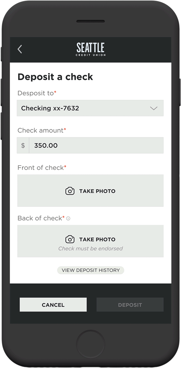
A user frustration that was uncovered when interviewing users and reviewing support tickets and analytics was that the older version of the application allowed a user to deposit a check without informing them of the proper way to endorse the check for acceptance. This resulted in checks looking like they were accepted only to be rejected hours later. This was an easy-to-understand pain point and we aimed to fix it through the UI by informing the user of the proper way to endorse the check, at the time of taking the photo. After implementing this change with the app launch, the number of support tickets and calls relating to this issue virtually been eliminated and the rate of successful deposit is in the high nineties.
I was also able to reduce some fields and additional pieces of information to give the screens in this flow a more simplified hierarchy of information. We also added a “sweet” success confirmation, to reward the user for accomplishing the task at hand. Moments of surprise and delight help give the product more personality, which in turn builds trust and affinity from the user.
User focus groups
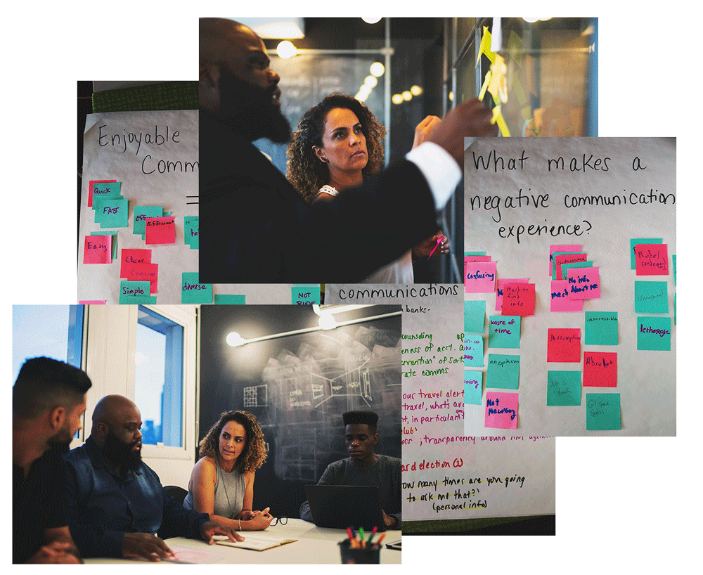
In order for us to properly assess what we were doing right in delivering a positive user experience to the credit union members, and where we needed to improve, it was important to conduct focus group sessions that gave us an opportunity to hear from them directly. We created a Member Focus Group that all members were invited to partake in via email, online banking messaging, on-hold waiting systems, and in-branch communications.
These sessions allowed us to assess user needs and feelings before we even started thinking about interface design. In our focus groups, we aimed to have roughly 9 participants, where we would discuss issues and concerns about the features of our digital tools like the website, the mobile app, and phone banking. The sessions typically lasted about 2 hours and were run by a moderator who maintains the group’s focus, while another team member would take notes.
These sessions brought out users’ instant and visceral reactions and ideas and let us observe some group dynamics and organizational issues. We asked people to discuss how they performed specific activities, their sentiment towards how that solution worked for them and asked them to give us characteristics of systems that were working well, and areas that were not. This information was invaluable in helping us better understand our user’s pain points, and tackle those problems with real empathy.
Personas
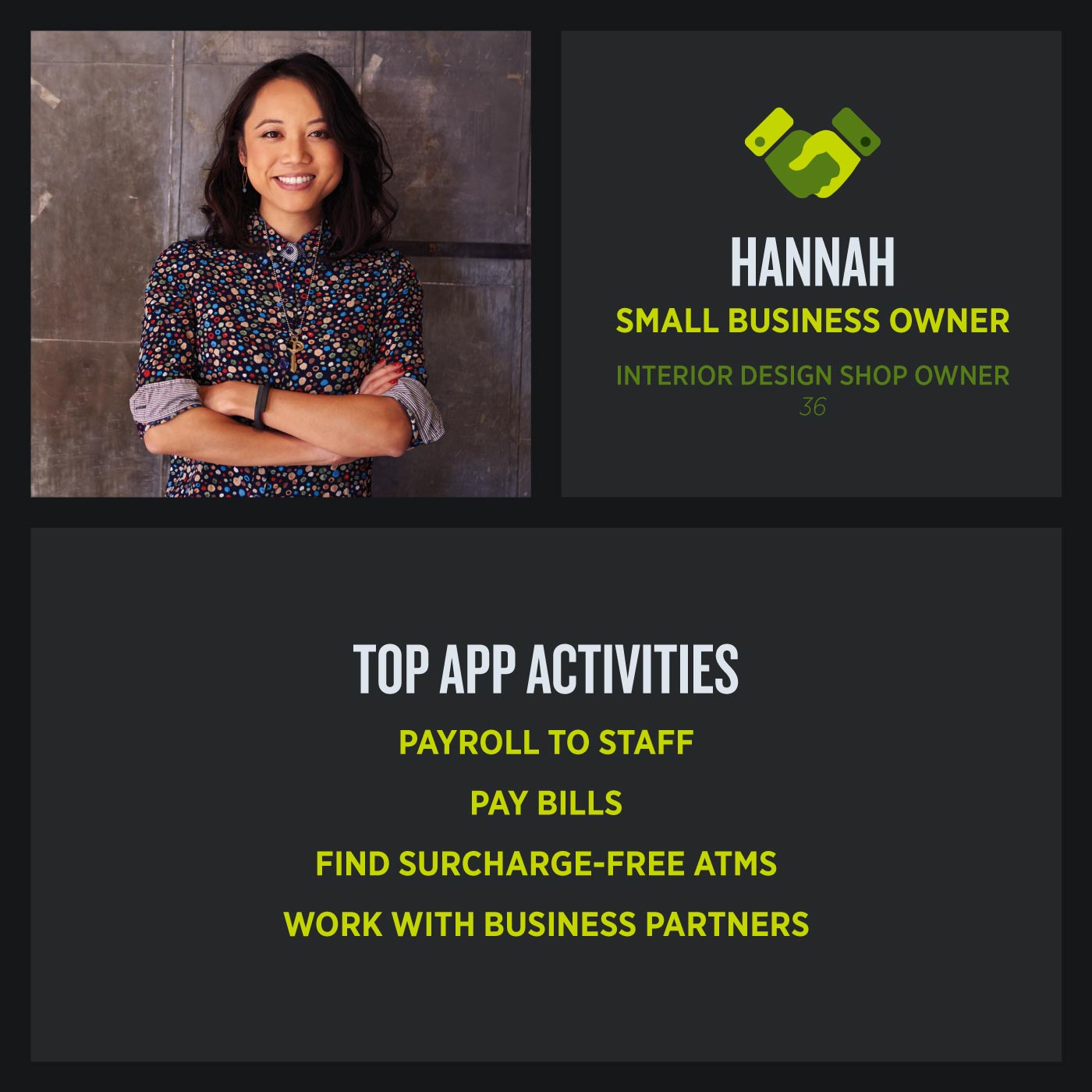
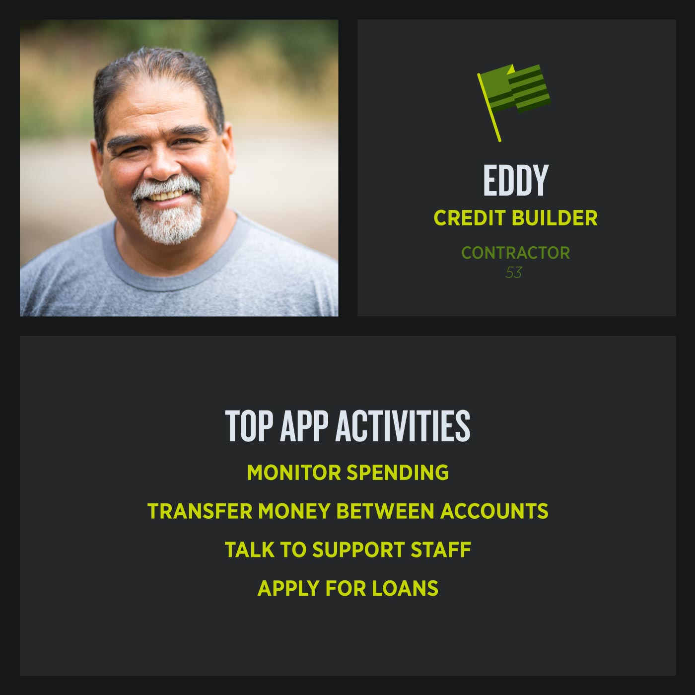
Understanding the mobile app users was fundamental to creating an exceptional mobile app product. In addition to the insights we gained from the user focus groups, we also worked with several departments who had first-hand interactions with our users, to more accurately create personas that encompassed the most common use-cases of the app. This helped our team find the answer to the most important question, “Who are we designing for?” The personas made it possible to understand the expectations, concerns, and motivations of our target users. (I have redacted all personal insights and detailed narratives specifically tied to member data for confidentiality with the client.) With four personas in total we found that although there were different factors to consider for each, it was possible to design a product that satisfies everyone’s needs and delivers on a delightful experience. This was our definition of success.


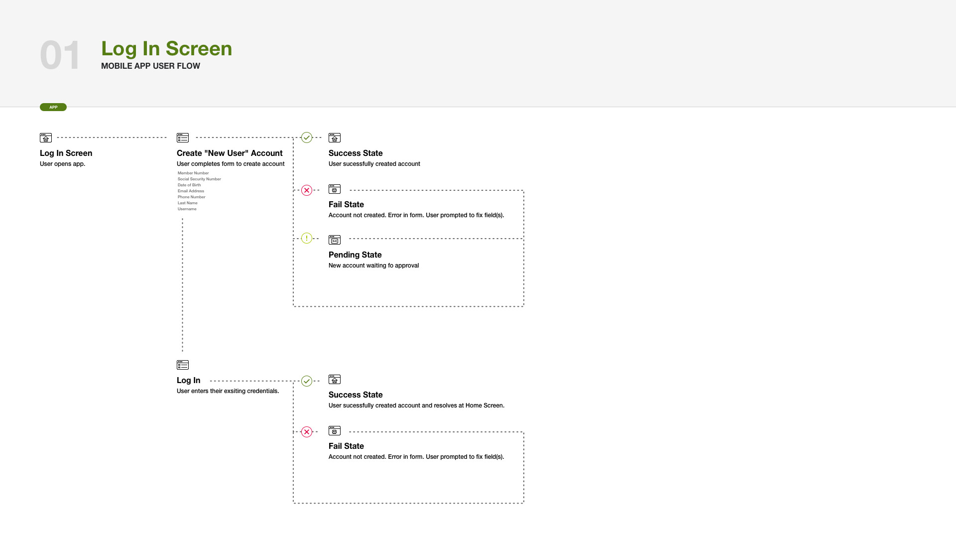
User flows
To coordinate the efforts of the Design, Operations, and Development team we created User Flows for the functions that we were enhancing as a part of the App update. These User Flows outlined the paths users can take to perform a desired action. By laying out each step graphically, it made it easier to conduct meetings where we could validate if the solution’s processes are complete, before spending costly design/development time. These flows also set up our Operations team for success to verify the app would integrate correctly with the credit union’s core system and third-party vendors.


Wireframes
Our team used wireframes to help us think through the content structures and organization of the sitemap, before we started getting to granular on how UI elements should be styled. The wireframe process went through several rounds of edits from multiple stakeholders including staff that was unfamiliar with previous versions of the credit union app. These reviews informed content hierarchy, page structure, interaction insights that would eventually all contribute to our app framework.
Leveraging the usefulness of wireframes allowed the design phase to move much more quickly, as I wasn’t committing too deep to aesthetics until I knew we all had agreed to the overall structure. It also helped me to focus on strategy and usability first, and stylization second. These steps helped us keep the user in mind through every stage of the process.
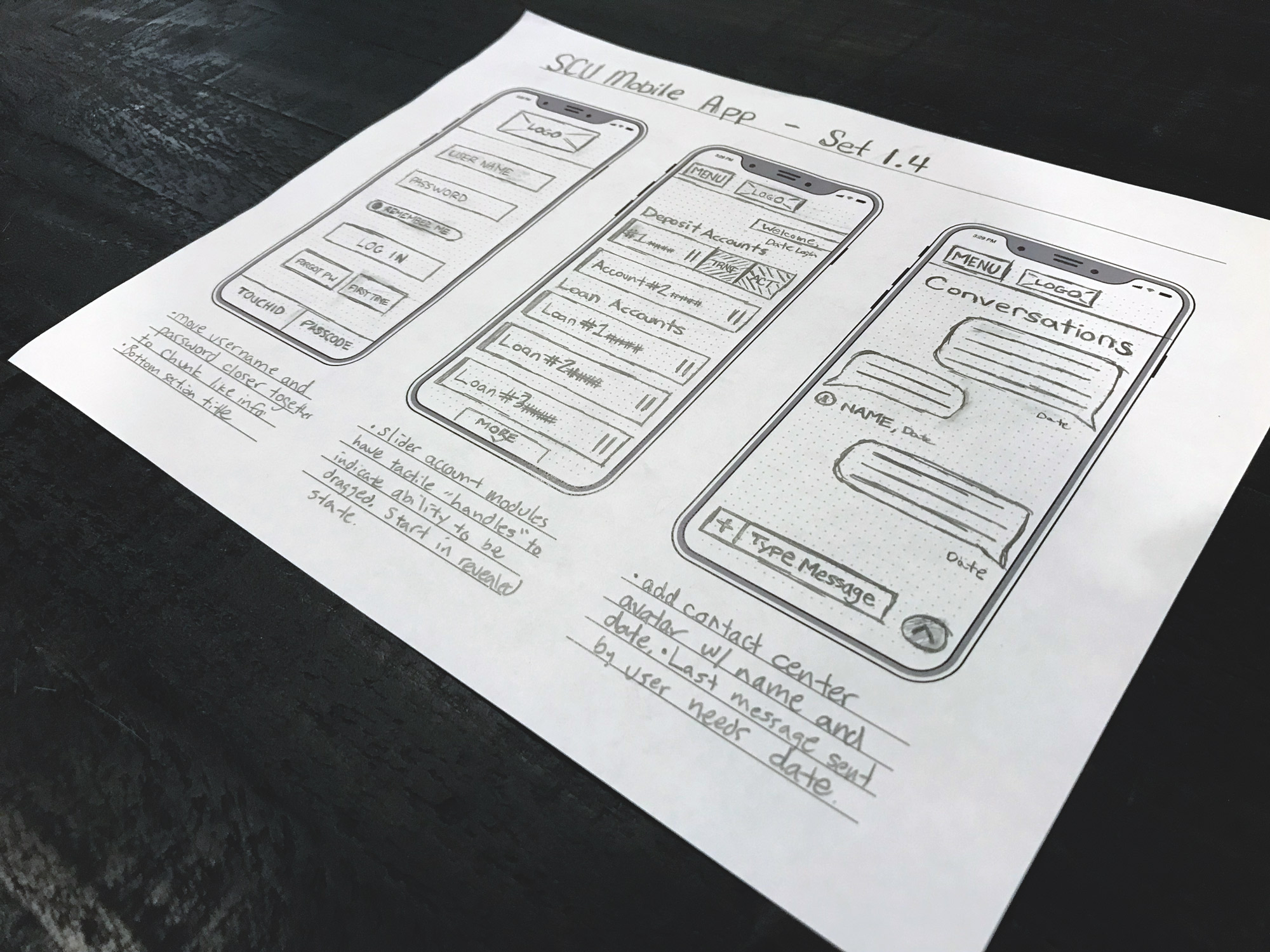
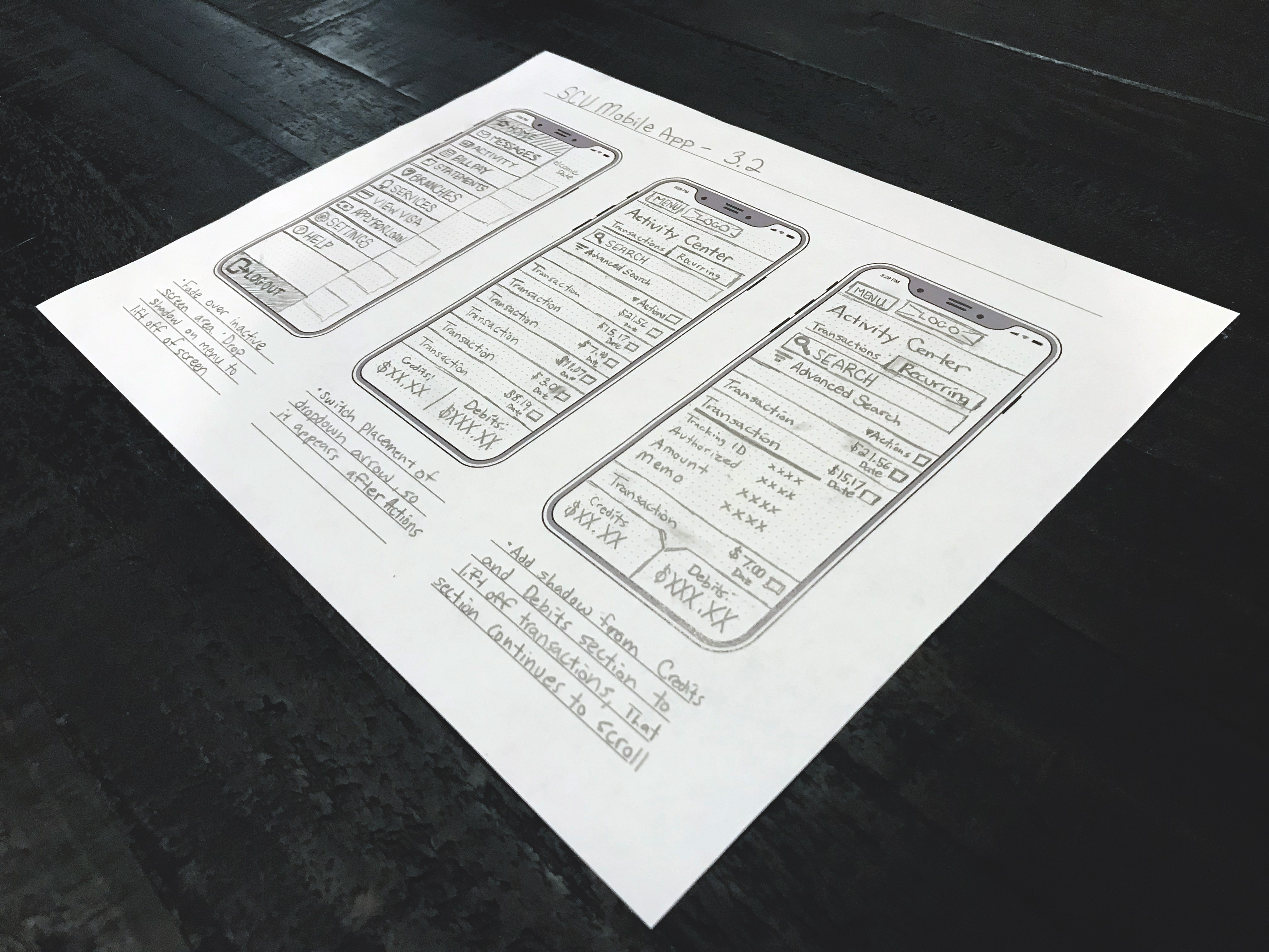
As a part of this project, I created a template for wireframing for mobile devices with specs close to the iPhone X. It features a light gray dot-matrix grid to help with placement and balancing. It also features a title bar for organizing your wireframes and a notes section for capturing decisions, next steps, and insights.
Results
All values measured year-over-year from the previous year’s activity compared to the first year of app activity.
26
Lift in overall app usage.
(A key performance indicator for the credit union in becoming a member's primary financial institution.)
(A key performance indicator for the credit union in becoming a member's primary financial institution.)
8
Increase in properly endorsed checks through the app.
6
Reduction in support calls to contact center regarding the mobile app.
User feedback
When I took on the project of redesigning the mobile app for Seattle Credit Union, the overall rating was 3.2 out of 5 stars in the app stores. The user experience had points of extra friction, that we were able to remove. Another main issue was that the visual hierarchy wasn’t clear and inconsistent from section to section. While we weren’t able to implement every enhancement in this update, we made great strides in improving the overall usability of the app. Three months after the update rolled out, the overall rating rose to 4.6 out of 5 stars and garnered a steady stream of positive feedback to the credit union’s contact center and social media channels.