


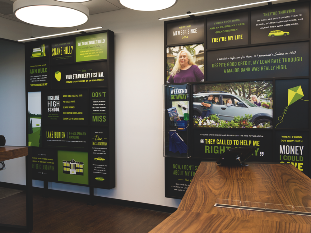
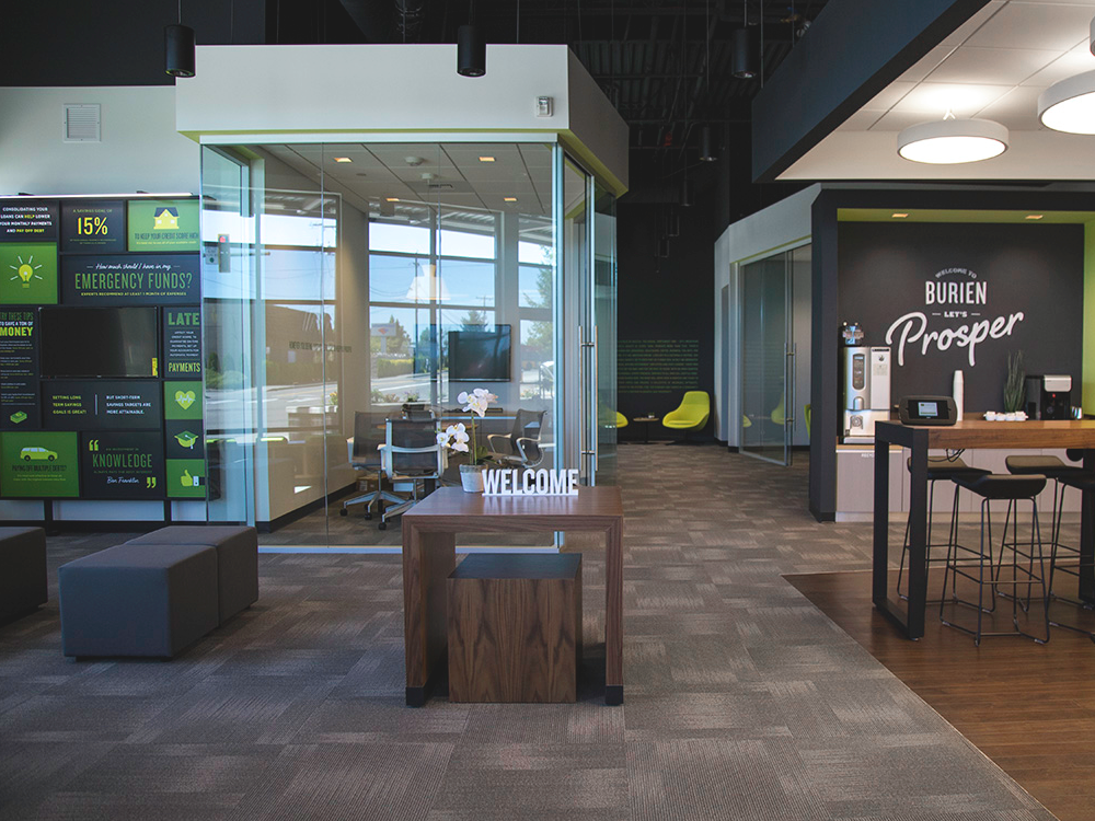
Working with TwentyFour7, we redesigned the interior space, or “architectural flow,” of our retail locations —replacing traditional teller lines with the self-serve technology our customers told us they wanted, and eliminating big, impersonal conference rooms, in favor of communal spaces conducive to genuine conversations. These renovations were a physical embodiment of the ultimate goal: to create a financial “classroom” for the community where the credit union can serve as financial allies and mentors for their members.
Seattle Credit Union
Tools
- Adobe Illustrator
- Adobe After Effects
- Adobe Photoshop
- Adobe InDesign
- Google Ads
- Facebook Ads
- Google Web Designer
- HTML/CSS/JS
My role
- Creative Director
- Lead Designer
Deliverables
- Brand guidelines
- Design system for digital products
- Product redesigns
- Website UX/UI design
- Go-live strategy
- Advertising
- Exterior & interior signage
- Social media launches
My team
- Jill Vicente
- Kevin St Clair
- Mark Banaag
- Kayla Johnson
- Kelly Nightingale
- Andy Wright
- Angela Schonberg
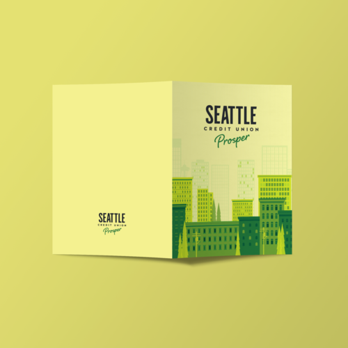
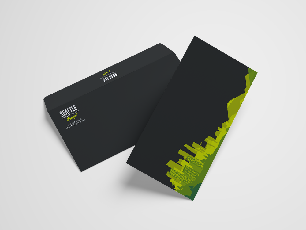
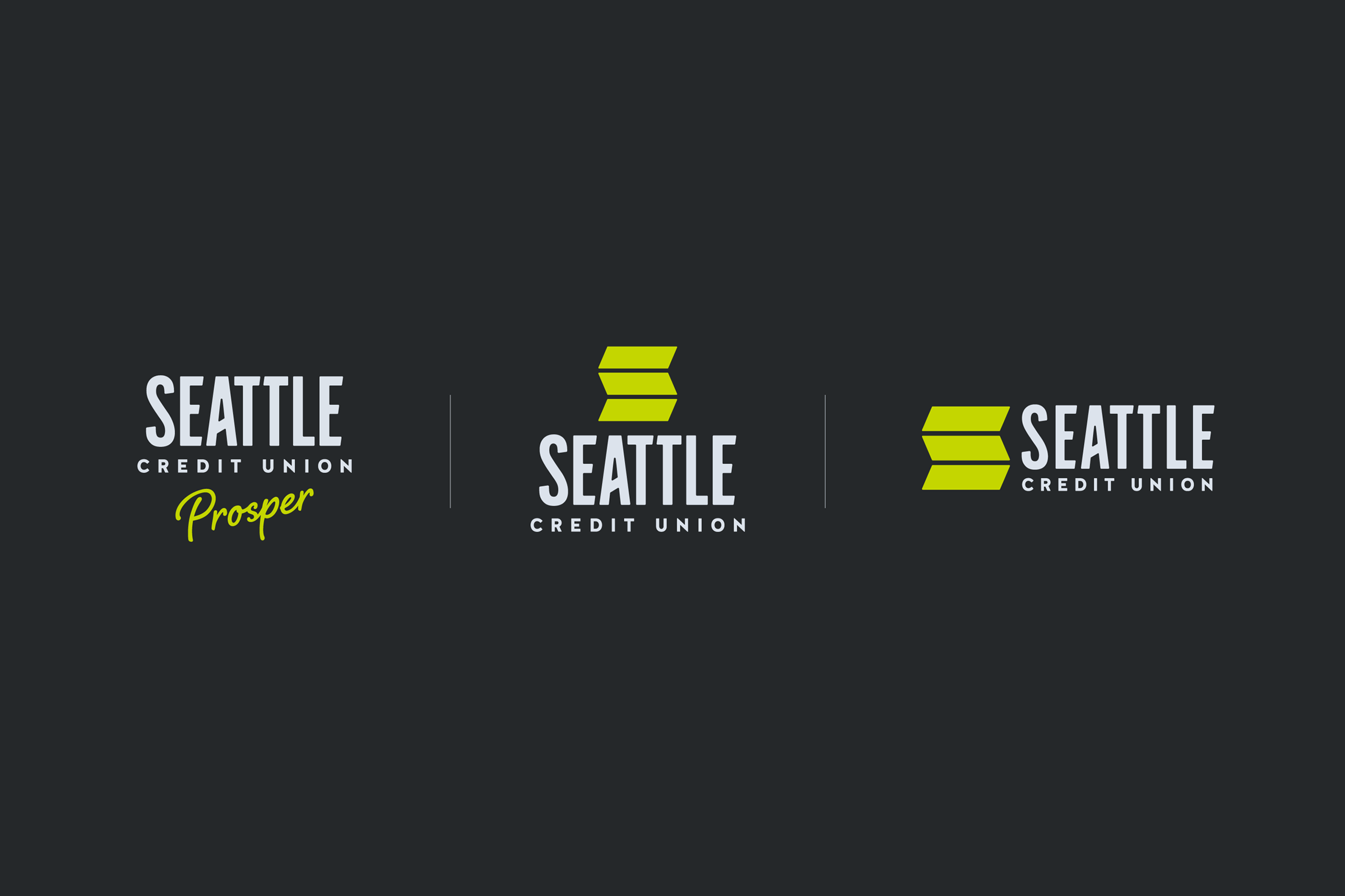
So much more than a logo
Seattle Credit Union has an incredibly rich history. City of Seattle employees came together during the great depression to pool their resources so that each person could take what they need, and seed what they could afford to help their fellow employees. It was literally neighbors helping neighbors. Over 80 years later, the credit union was still living up to its original purpose. But as the city grew, so did the demands people had of a modern financial institution.
I had the pleasure of leading the marketing efforts for an organizational rebrand of Seattle Metropolitan Credit Union. Our in-house team worked with an incredible group of talented creatives at TwentyFour7 to revamp the brand aesthetics, recommit ourselves to the original credit union mission, and remove a hard-to-remember, five-syllable word from the name.
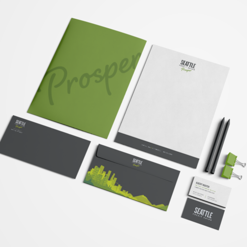
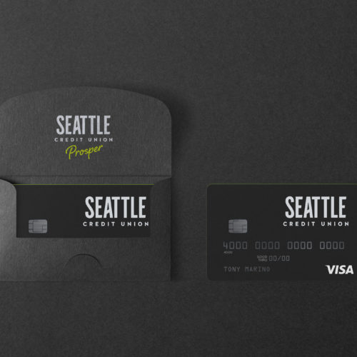
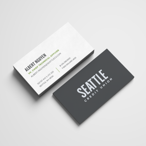
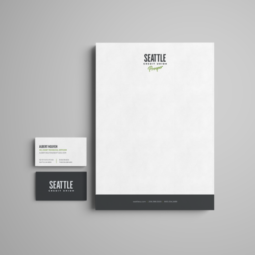
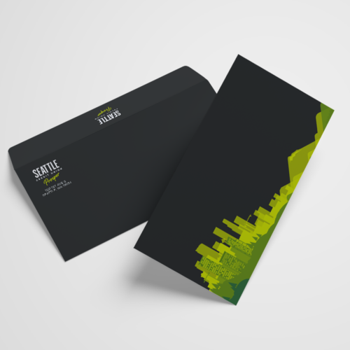
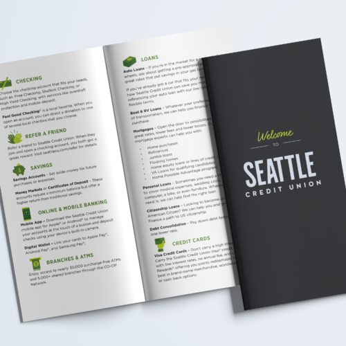
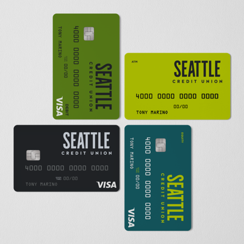
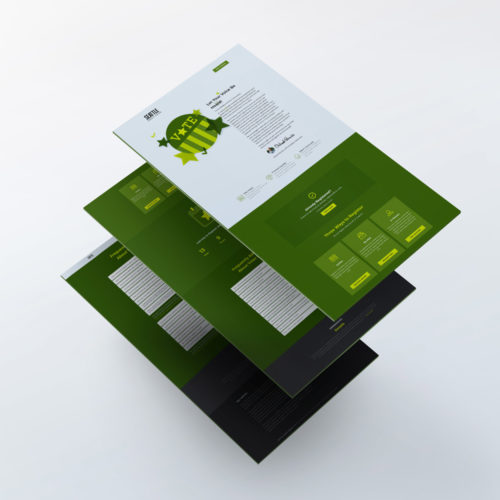
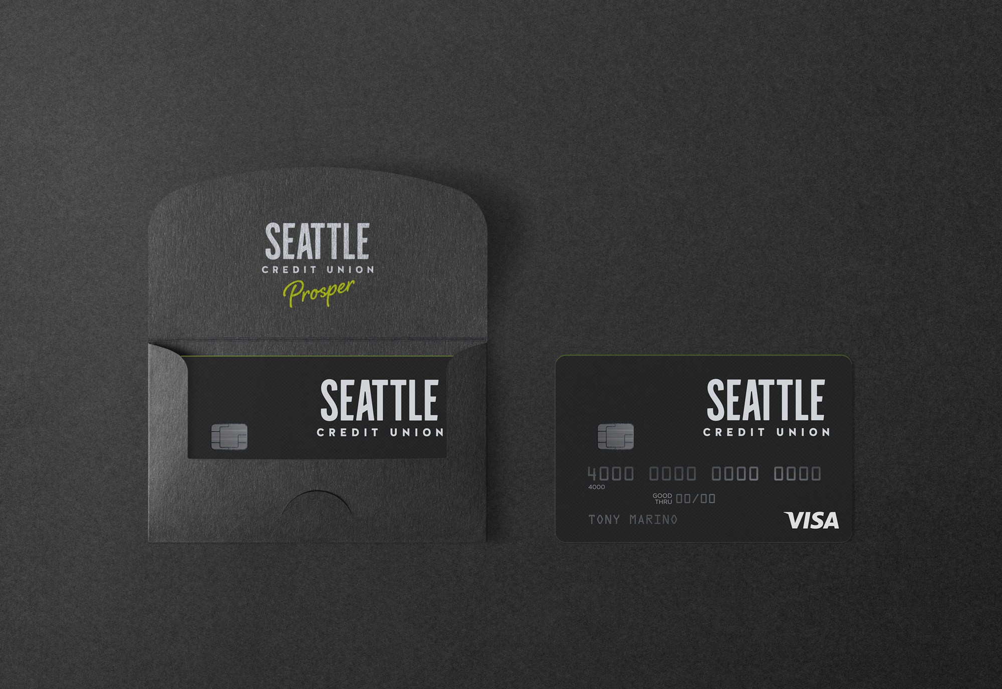
What resulted was a new logo, brand guidelines, visual center, updated website, hundreds of rebranded bank forms, (I wish I was exaggerating) a revitalized social media presence, and updated retail spaces that removed the typical stuffy feeling of a bank, and replaced teller lines with casual meeting spaces where members could go over their finances without feeling like they were holding up the line.
I think it’s every designer’s dream to take on a rebrand project, and I’m so thankful that I got to help transform a brand that is committed to making a difference in their local community.
Charcoal
#25282a
Moss
#567d15
Bolt
#c4d600
Ice
#ced9e4
Marina
#3e87cb
Puget
#115e67


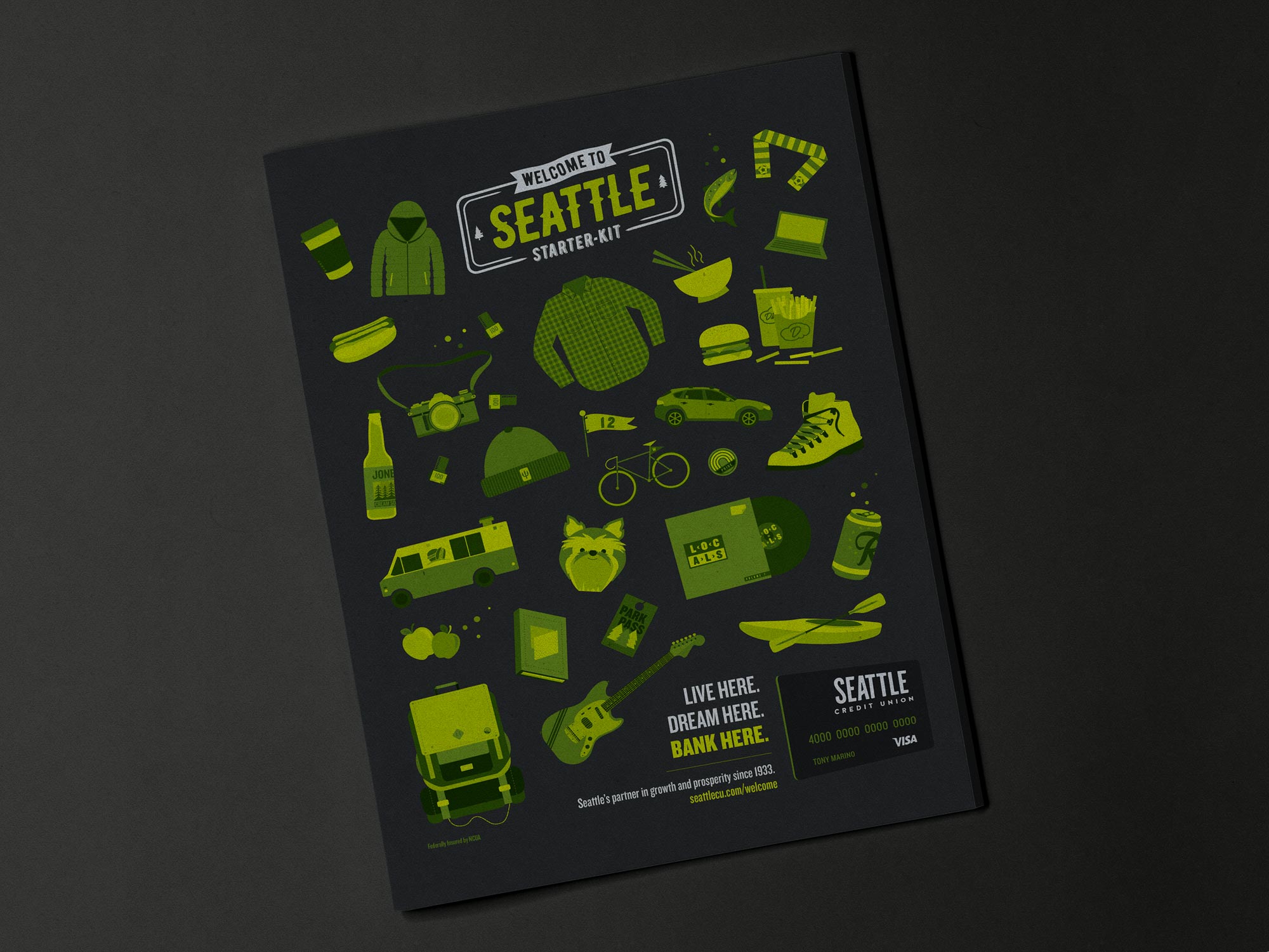
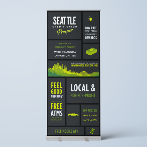
Retail spaces built for engagement
Integrated rich media ads
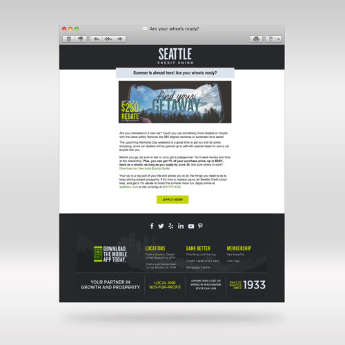
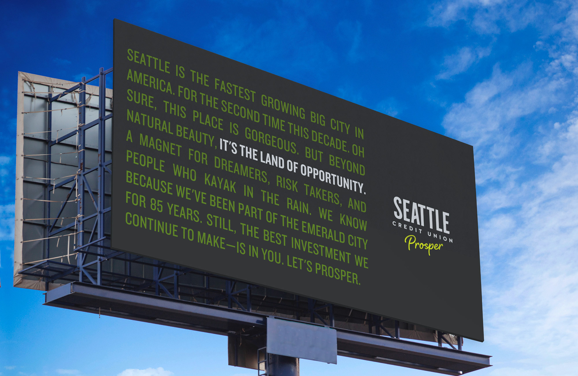
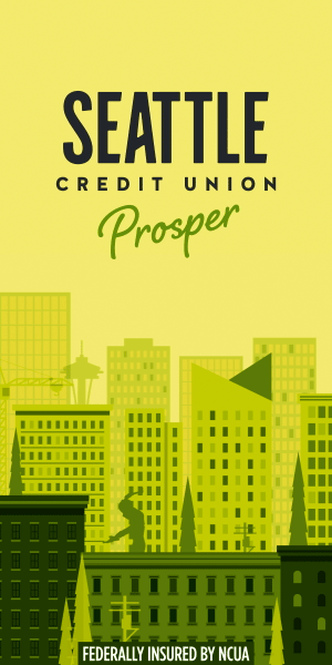
To get the word out about our name change we did a large integrated campaign on various digitals channels. Through Google DV360 DSP (Doubleclick) and Facebook, we retargeted all visitors to the Seattle Credit Union website with pixel-based rich media ads raising awareness of the upcoming name change, and ultimately highlighting the new name and visual center.
To really make an impact, we chose a few key media outlets and coordinated digital takeovers for the week of our rebrand announcement. One notable partner that aligned well with our core demographic was King 5. We took over the homepage with a series of rich media ads, like this one.
Finally, to get people excited about Seattle Credit Union’s commitment to being the city’s partner in growth and prosperity, we launched a series of videos that would play on broadcast and OTT outlets during news hours and local live sporting events. We supplemented those placements with Pandora and Youtube. The original video that launched the campaign is playable below.
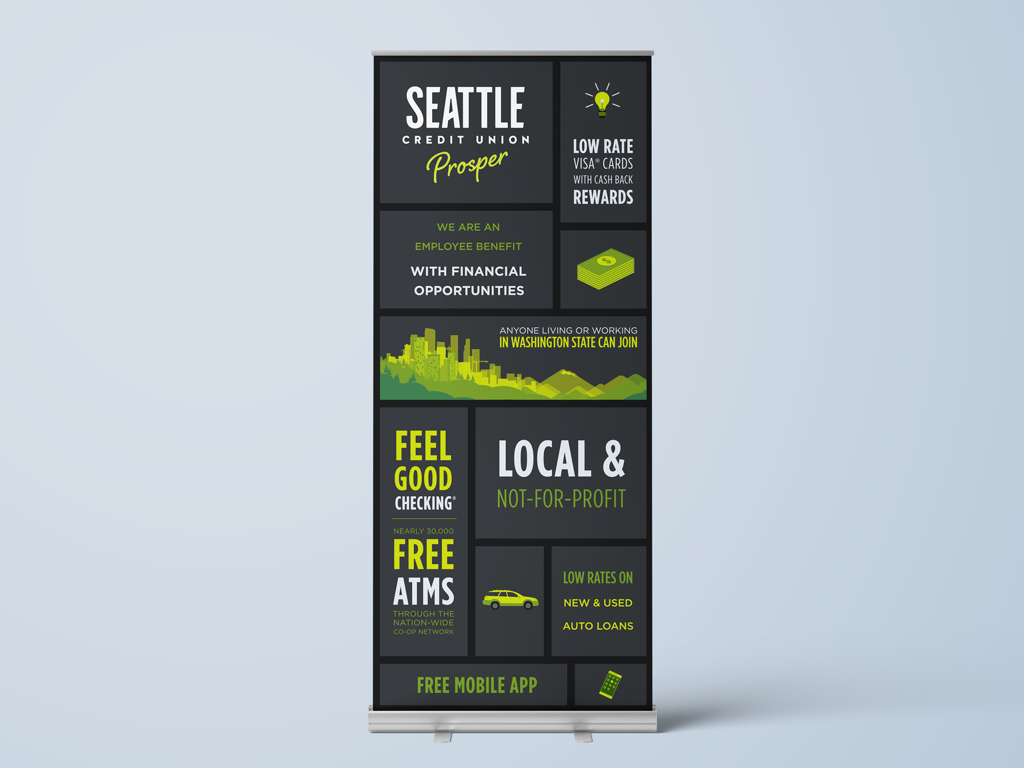
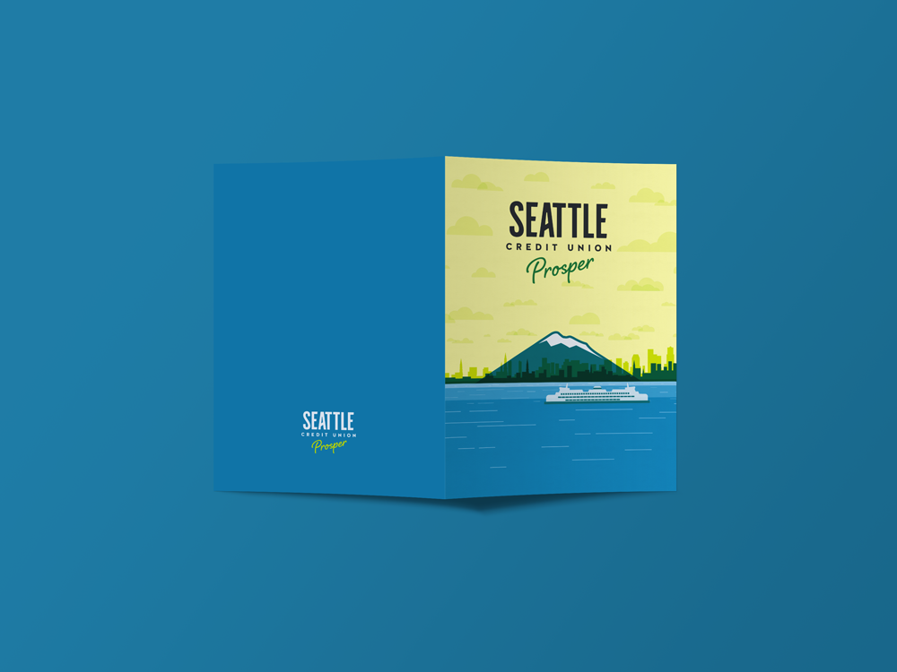
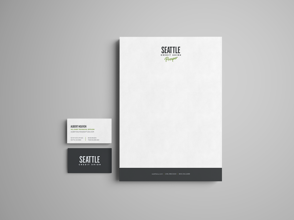
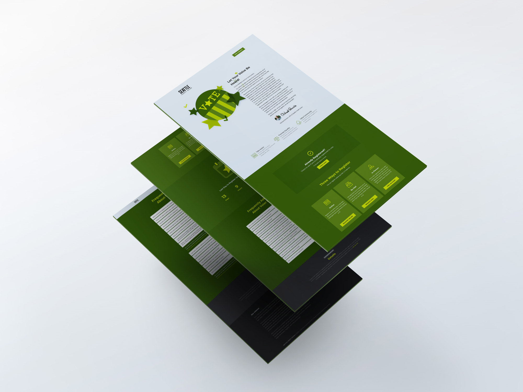
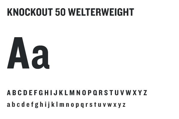
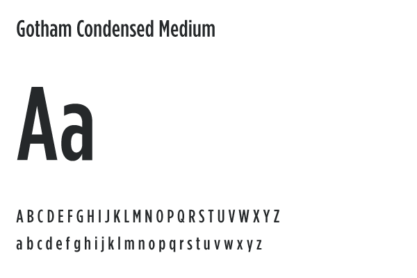
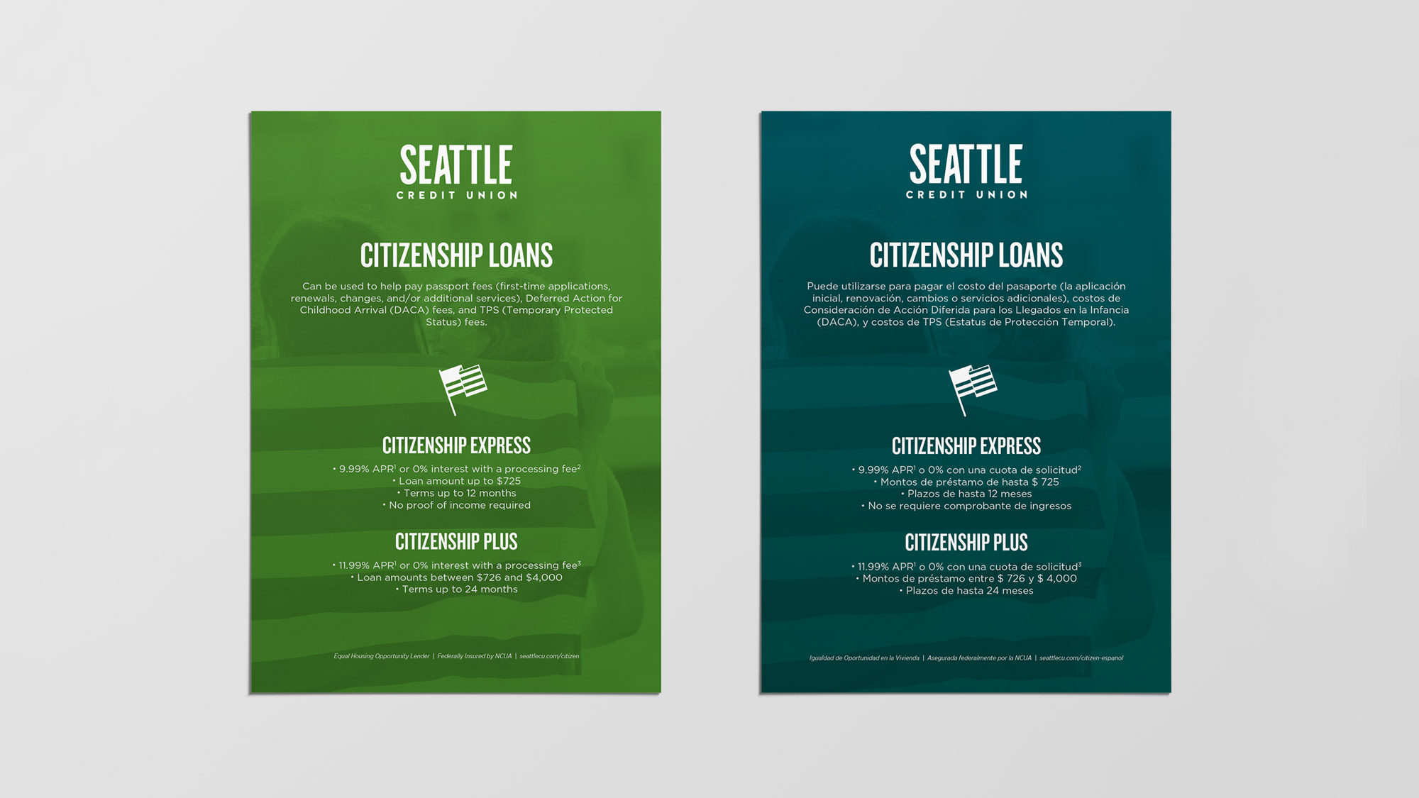
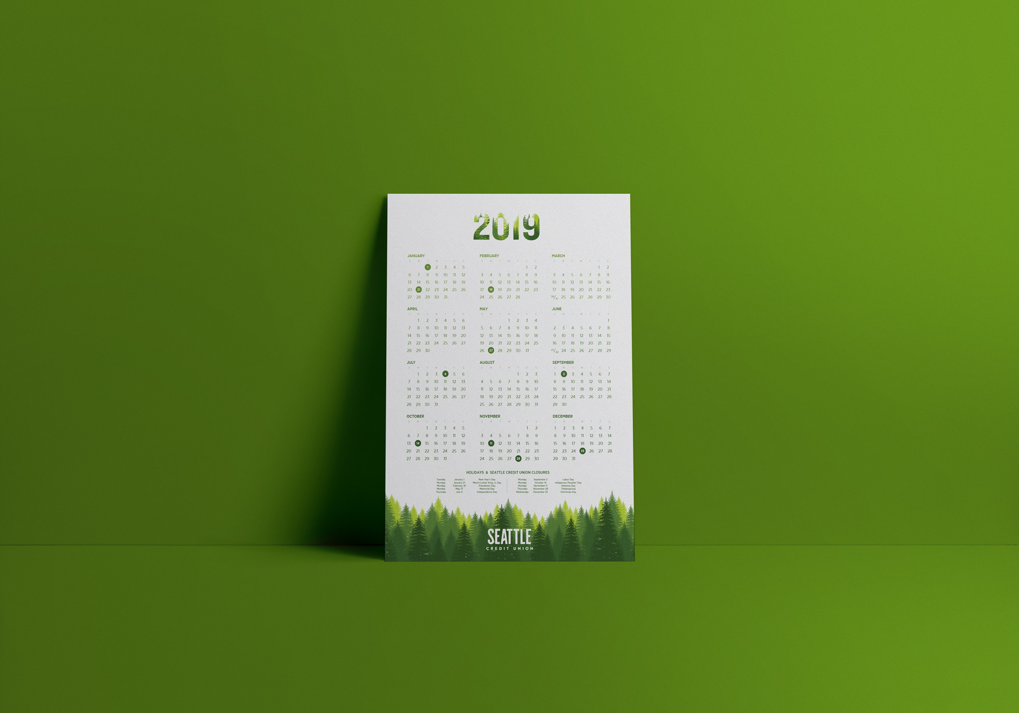
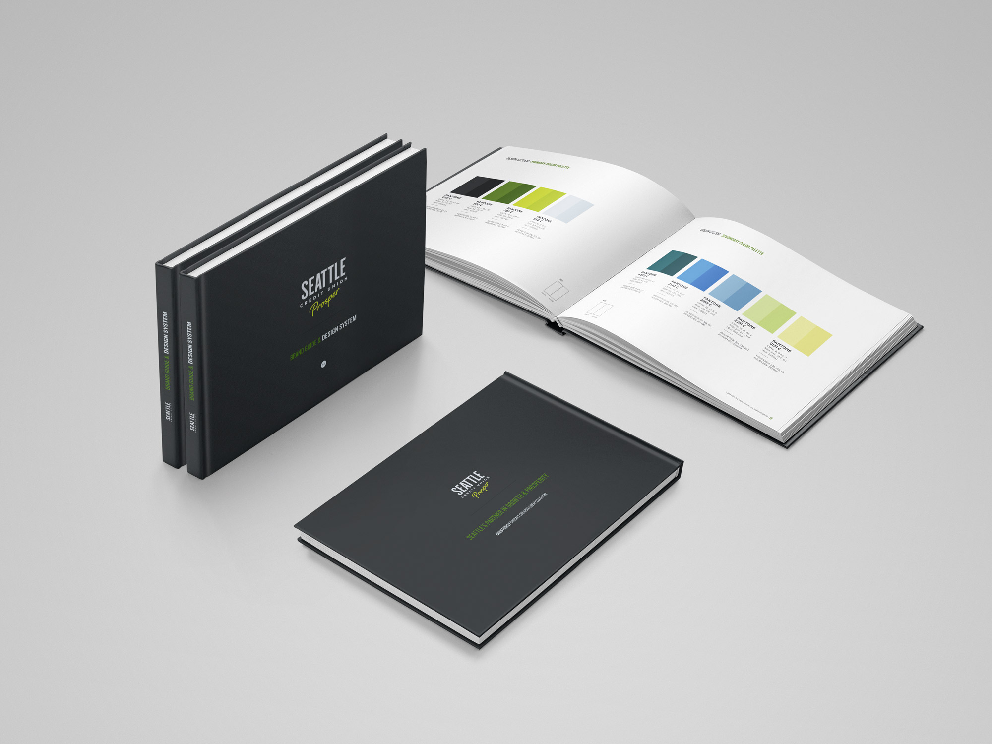
Brand guide & design system
The team contributed to building a design system that could be versatile enough to handle the credit unions wide breadth of creative projects. From direct mail campaigns to mobile app design, this system applies color theory, typography, and design principles to ensure consistency.
This guide helps the whole creative team function quickly while reducing design debt, especially as the organization scales. This allows for new vendors to be onboarded, third-party plugins and applications to be skinned, and for all marketing pieces to have a unified look, feel, and tone.

Branded content
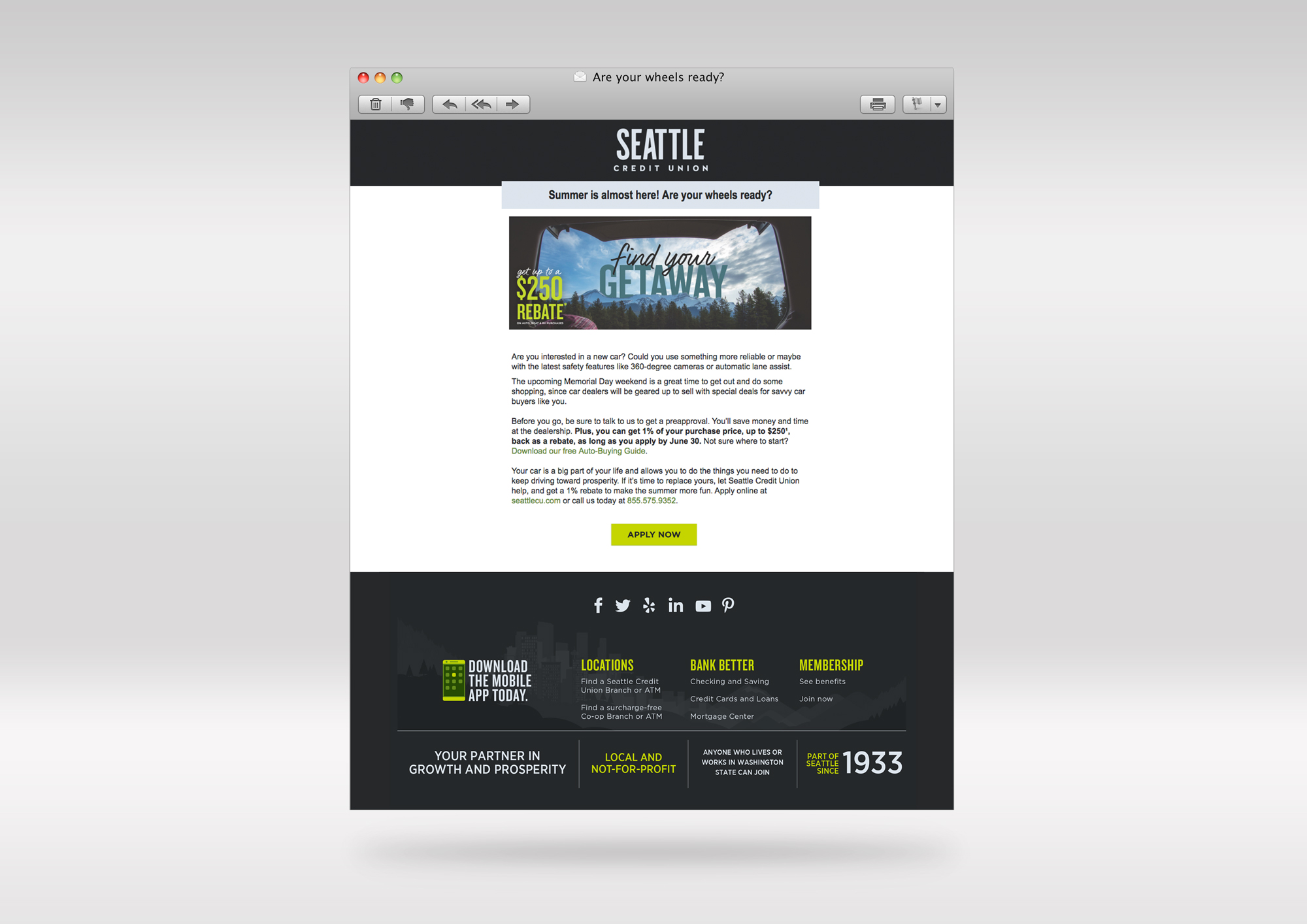
In an effort to deliver on the promise of being a person’s partner in growth and prosperity, we needed to meet them where they’re at and help them take the first step. Many of our members and potential members aren’t aware of how certain products work, or how to compare one financial institution or banking product to another. To solve this problem, we created a series of free print books and electronic eBooks. We cover topics like “11 Steps to Home-Buying” and “Auto-Buying Guide: How to Buy A Great Car and Avoid Expensive Mishaps“.
In each book, we offer best practices, advice from experts in the field, easy-to-digest infographics, a rundown of tricks and scams to look out for, and a summary of how to make an educated decision regardless of whether you choose to bank with the credit union or not. This content has been very popular, boosting our organic email list sign-ups by nearly 140%.
Results
8
Increase in new membership growth rate (over first two quarters of rebrand)
12
Increase in organic website traffic
23
Increase in social media engagement